
Cut, Paste, Revolt
How Punk Learned to Speak in Ink

I started listening to metal and punk in the late 80’s at a time when Internet and digital music platforms were still a matter of science fiction. Underground bands had to resort to more conventional methods for sharing their music with the fans, with tape trading and mail-orders via xeroxed catalogues being the most common ways to access music outside of the mainstream circuit.
For those who had lived in those times, it was a kind of ritual. Enclosing pre-stamped envelopes, IRCs (international reply coupons) and well hidden cash inside the letters and then waiting for several weeks -if not months- to receive the demo or the 7-inch (in best case) of a promising new band. The parcels were arriving always stuffed with flyers that were “advertising” the releases of other bands and this was a form of expressing unity and “solidarity” across the scene. Each flyer was sent in multiple copies, one was usually kept as collectible and the rest were being “forwarded” with the next letters/orders. This act of this flyer circulation was eventually a way of making everyone an active and contributing member of the scene whether he was in a band or not…
Very soon this early, totally DIY way of marketing and communication became a form of Graphic art. This evolution is what Too Fast To Live, Too Young To Die : Punk & Post Punk Graphics 1976-1986, the 2016 book by Andrew Krivine explores. Kirvine was lucky enough to be around and be involved in the punk scene since its humble beginnings in 1977 and this gave him access to original graphic material such as flyers, posters and record covers. He is currently the owner of one of the largest collections of punk and post-punk graphic design and memorabilia in the world, a collection which is still growing until today and part of it is presented in the book.
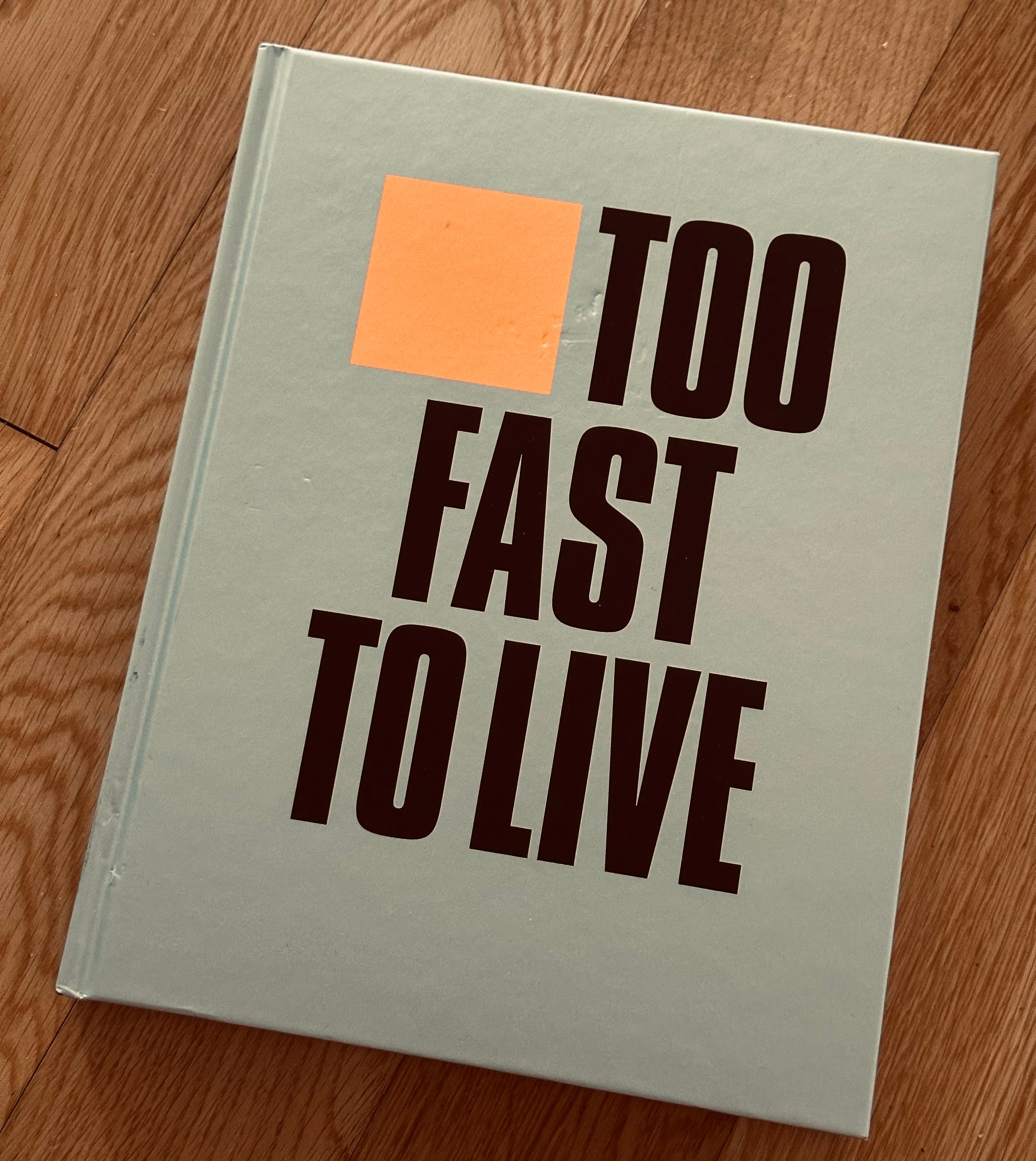
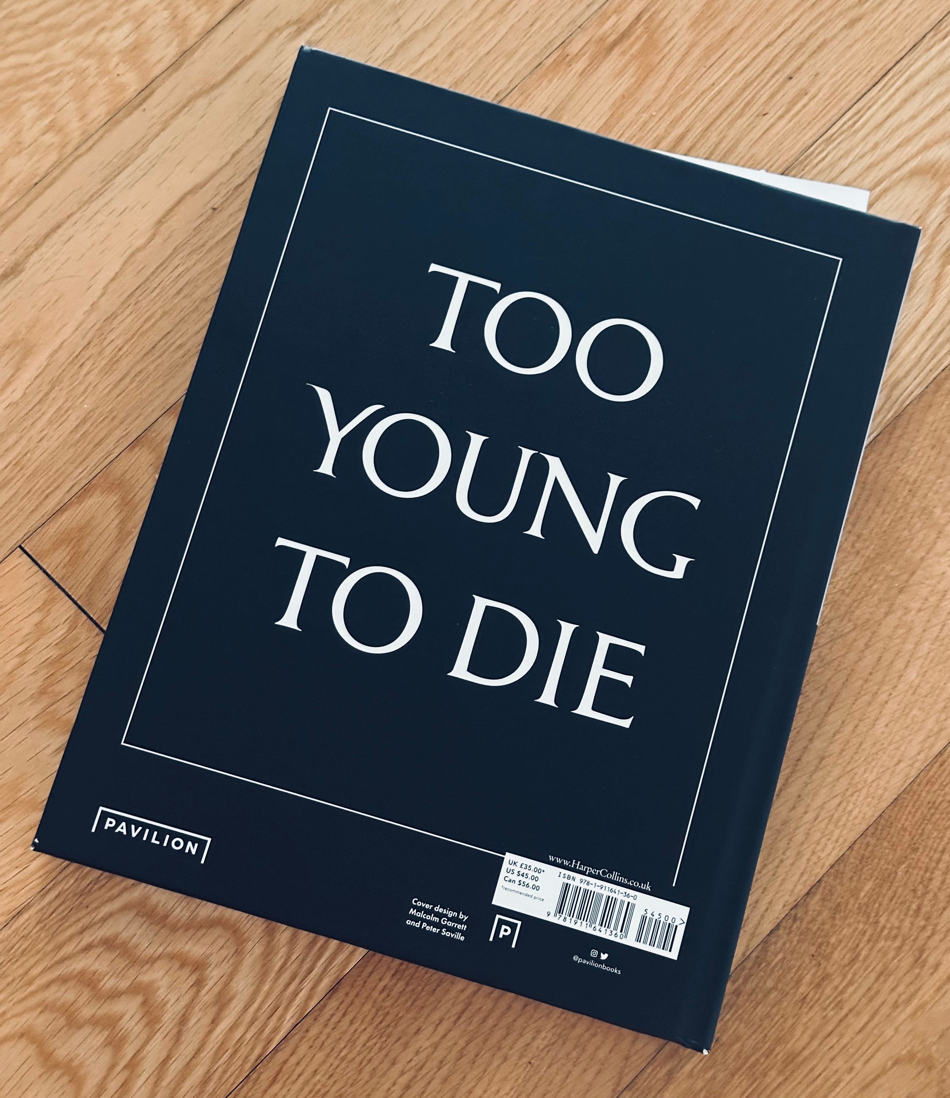
As Kirvine writes in the Editor’s notes, Too Fast To Live, Too Young To Die : Punk & Post Punk Graphics 1976-1986 does not aspire to be a comprehensive history of punk. It is rather a visual history of the graphic art that this music inspired and helped evolve. 650 posters, flyers and record covers - selected out of a collection of 3.000! - are spread in 352 pages capturing from the early and pure DIY days till the later times of the inevitable (?) commercialisation.
There’s no doubt that Malcolm McLaren and Vivienne Westwood’s smart employment of Jamie Reid to oversee the creation of a Sex Pistols visual identity and their canny fashion business know-how made their band the slickest and best-structured on the punk scene, although at times it was difficult to see any difference in the Pistols’ graphic presence and that of the major corporations and advertising practitioners that the scene was supposed to be disrupting and parodying*.
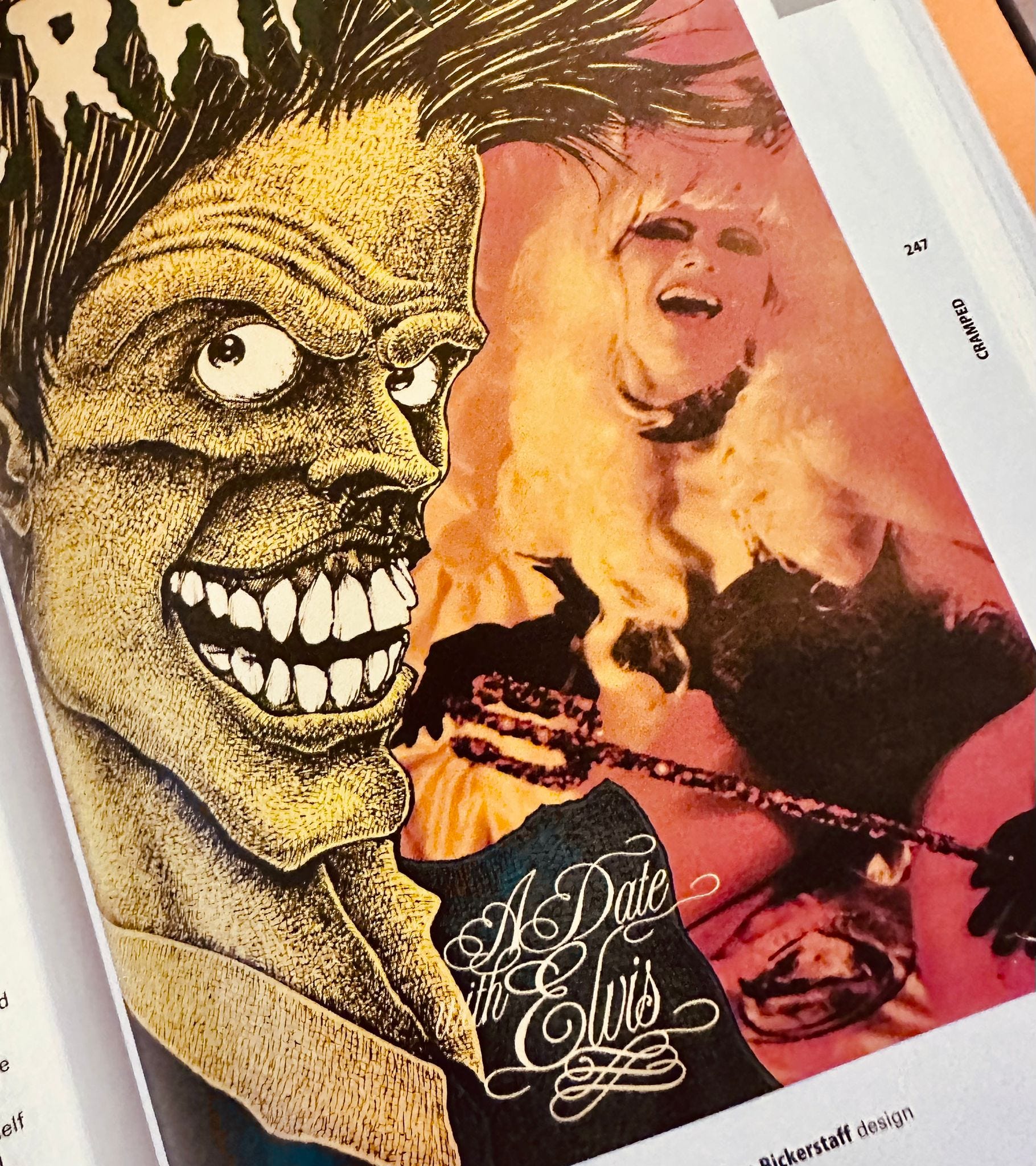
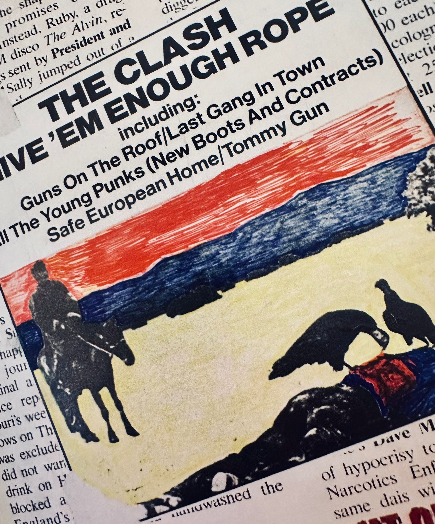
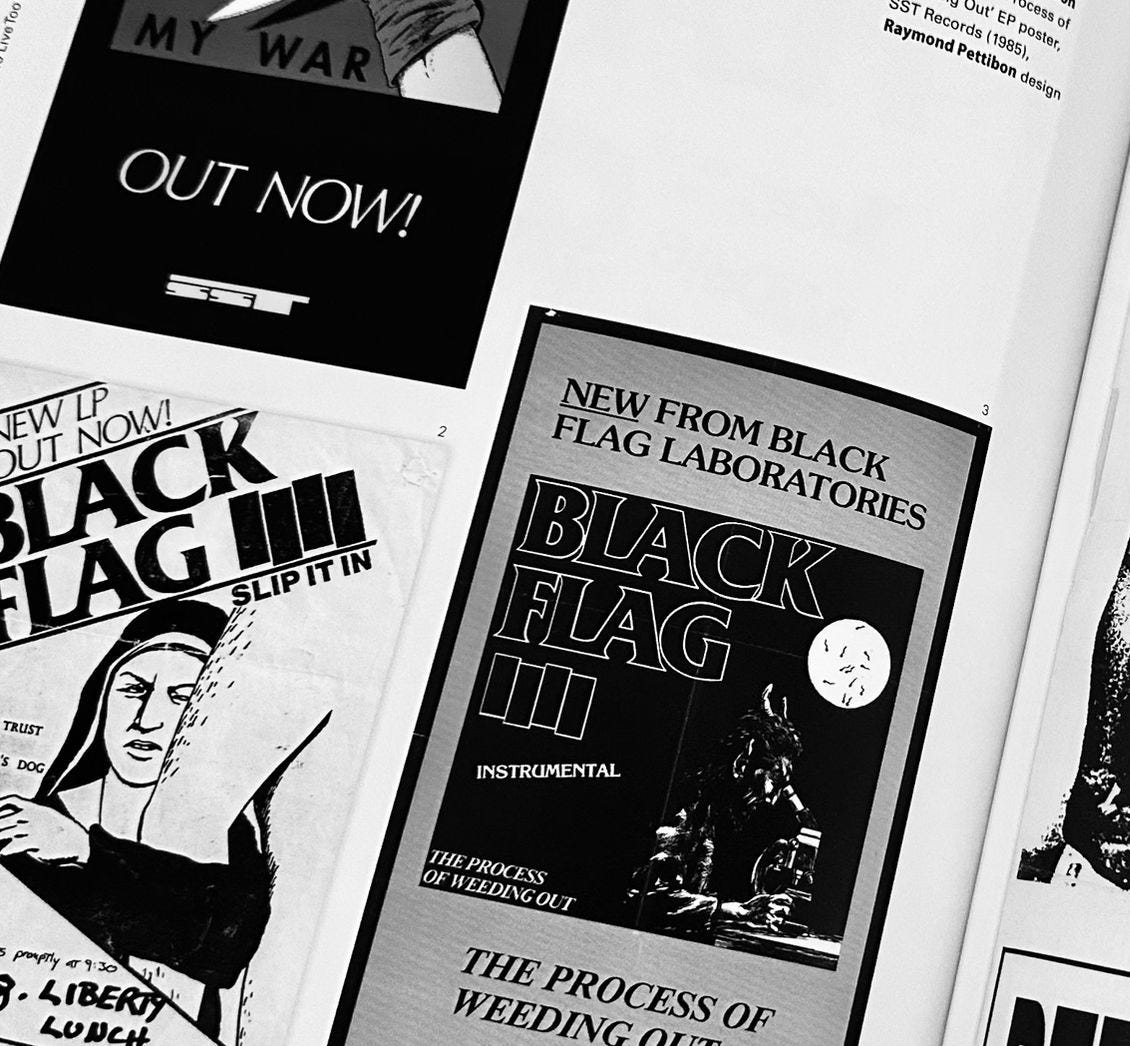
(Page samples intentionally redacted - for a full visual experience and pleasure, the reader is advised to purchase the book)
Too Fast To Live, Too Young To Die : Punk & Post Punk Graphics 1976-1986 is neither a photo album nor a punk rock scrapbook. The high quality pictures and scans are supported by essays provided by graphic design experts, academics and commentators. Among them the former art director of New York Times Steven Heller, the reader in graphic design at the London College of Communication Dr Russ Bestley, the graphic design writer Rick Poynor, the designer Malcolm Garrett and the Pulitzer Prize-winning editor Michael Wilde making Too Fast To Live, Too Young To Die : Punk & Post Punk Graphics 1976-1986 a book that punk rock aficionados, scene nostalgics and aspiring graphic designers can enjoy.
*Excerpt from the chapter I wanna be me.
Fascinating angle on how constraints actually fueled punk's visual identity. The ritual of mail-order flyer circulation as community-building tool is something we've totally lost in the algorithm era where distribution is frictionless but connection feels more transactional. I've been digging through old zines lately and there's this tactile intentionality in every cut-and-paste layout that screams authenitcity way louder than any Instagram aesthetic grid. The Sex Pistols paradox you mention about disrupting corporate culture while using slick branding is still super relevant today.